Over the weekend, we finished the baby's room. By "finished" I mean, as good as it's going to get before the baby comes.
Above, you can see the view from the doorway if you're standing in the hall.
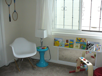
If you follow me on Pinterest, you know that initially, I had wanted to do a nautical themed room. Chuk was concerned that a nautical room would look too grown up for an infant and would read as too boyish with so many blue accents. Since we're waiting to find out the sex of our baby, we needed a gender-neutral nursery. Ultimately, we decided to do a room of bright, happy colors with vintage accents, particularly vintage sports accents.
(From all the cords in the corner, you can tell I don't bother to stage photos. Eh, the room doesn't need to be baby-proofed immediately, right? Don't worry, we'll secure them before the baby becomes mobile.)
The main challenge in decorating this room was that, as renters, we can't paint or change the flooring or other fixed elements. Builder beige walls and taupe carpet doesn't really contribute a lot to the idea of "bright, happy colors", but fortunately baby accessories tend to be bright.
In these photos, the room looks significantly larger and better proportioned than it is in reality. Because the rest of our apartment is small too, we need to keep all the baby toys in this room and it has to function as a playroom as well as a bedroom. (It's also my husband's office. His desk and all our files and office supplies, as well as general household storage, is in the closet.) To accommodate all these functions, we tried to keep the furniture against the walls and added storage to the wall, so there would be space to play in the center of the room.
We couldn't afford to spend a lot so we took advantage of gifts, things we already owned, second-hand finds, DIY projects, and generally just made do.
We still need to finish the crib skirt, hang artwork, and decide whether or not we're going to paint the dresser (there's a long story behind it that makes the decision less than straightforward.) I'd like to find an affordable and colorful rug to disguise the carpet too, but so far, we're really happy with the room. It is such a satisfying feeling when your vision materializes the way you imagine it will.


Nice! I love that you put a mirror down at baby eye level.
ReplyDeleteI know how you feel about dealing with renter's decorating dilemma. I think you succeeded in decorating it with bright colors - it looks so cute! I love the vintage coke machine. What a neat find!
ReplyDeleteIt looks GREAT! I think you made it look so lovely and inviting. All ready for baby. :-)
ReplyDeleteI really like the primary colors and the book shelf under the window :)
ReplyDeleteI LOVE it!!!! The fabric you used to make the changing pad cover is super fun--almost reminds me of a beach towel (in a good way). I think putting the mirror under the window is genius, especially as your baby gets older and can interact with his/her reflection. How did you attach it?
ReplyDeleteRe: gender neutral paint/rooms. The bedrooms that will belong to our future kids were just painted last week. While we own our home, I purposely went with neutrals because it'll still be a year or two before anyone lives in those rooms. I also don't plan on finding out until the birth, not to mention, young kids don't care about what color is on the walls, and it'll give me mileage until it's time to repaint. I will also be doing bright, cheery colors/decor when the time comes. SO SMART!!
We attached the mirror simply with nails. There were hanging hooks on the back of it, so it's still very secure. Safety first!
DeleteI LOVE how you used the space under the window! Brilliant!!! It's inspired me to tweak our current nursery situation, especially since I need to make it more friendly for playtime.
ReplyDeleteThanks! Our little one is just starting to get into the mirror and having the books there is so convenient.
DeleteI love this blog because it is user friendly with appreciative information.Very helpful article even for like me.
ReplyDelete